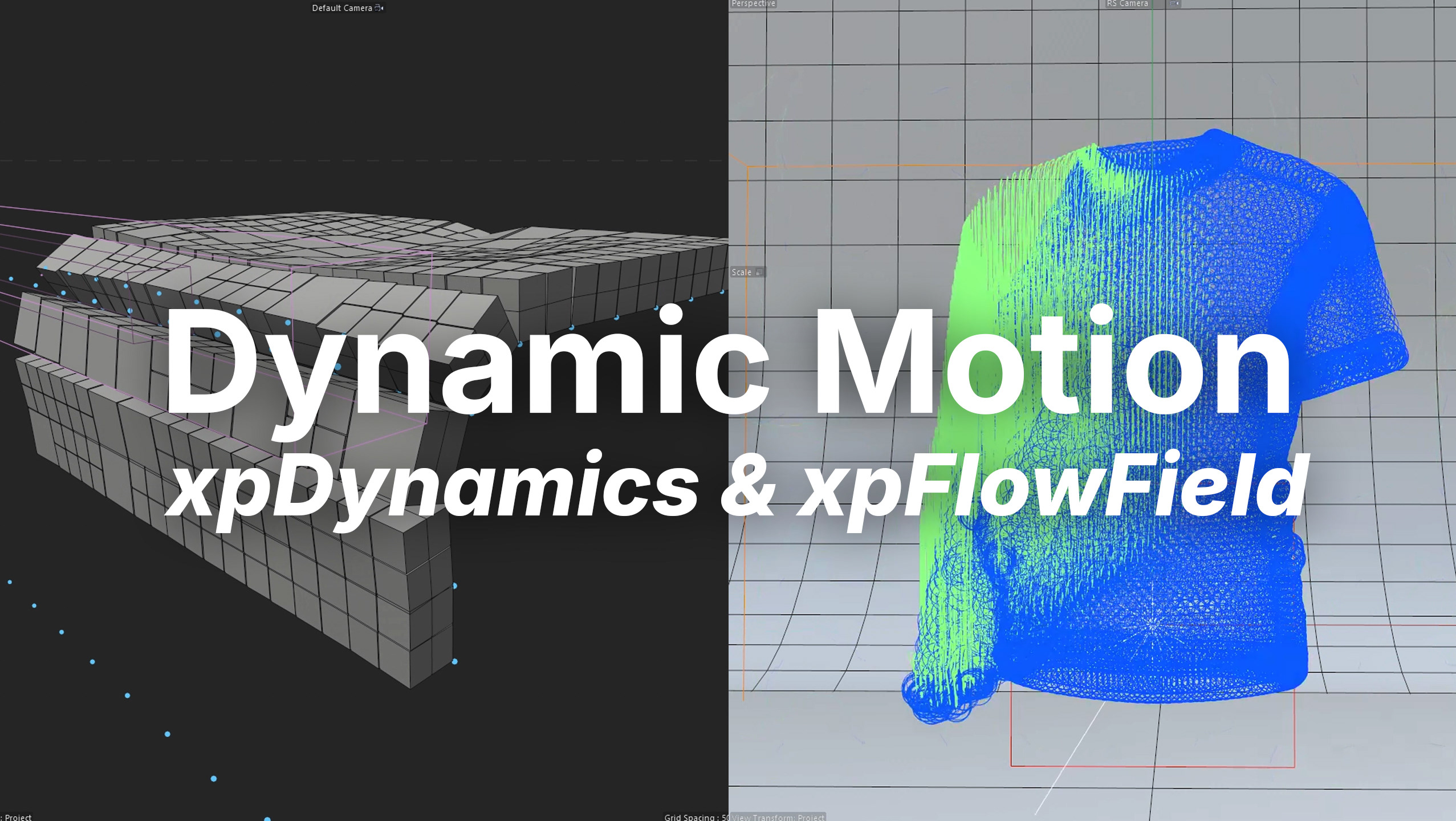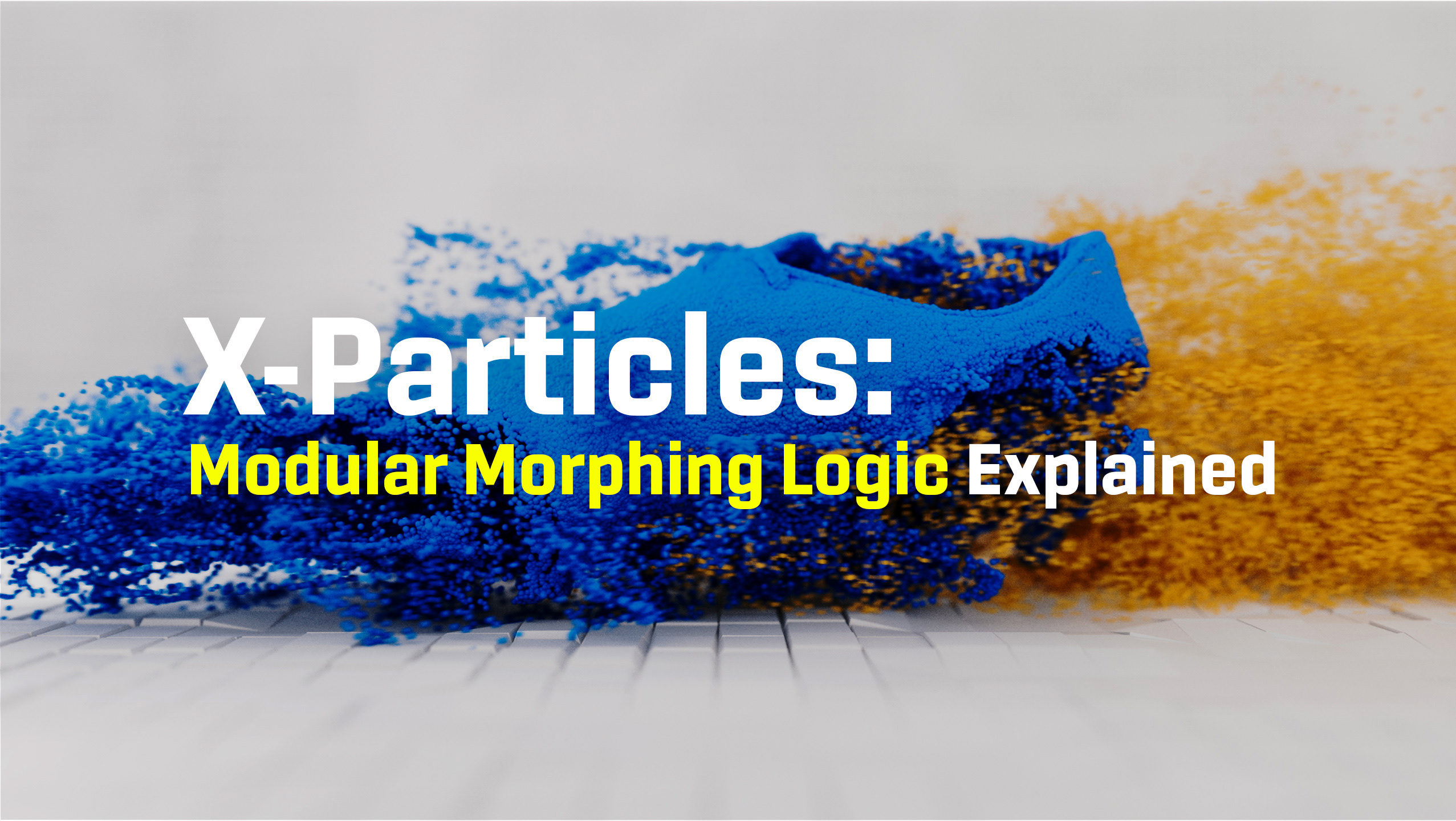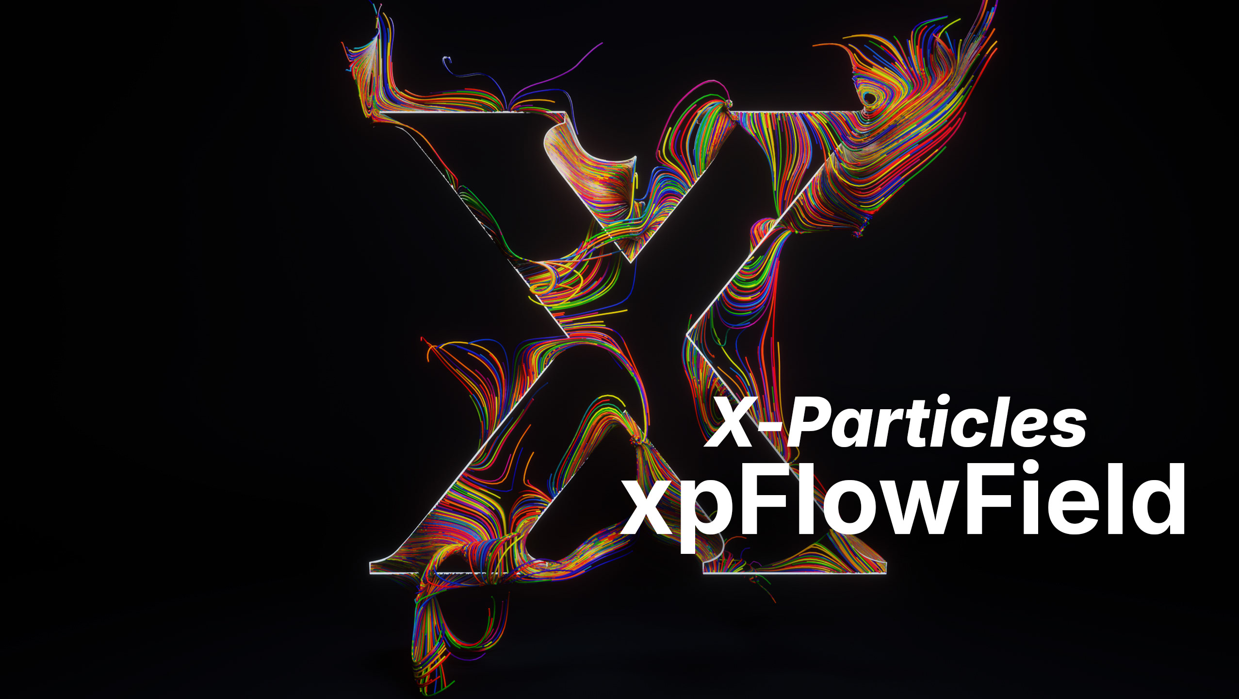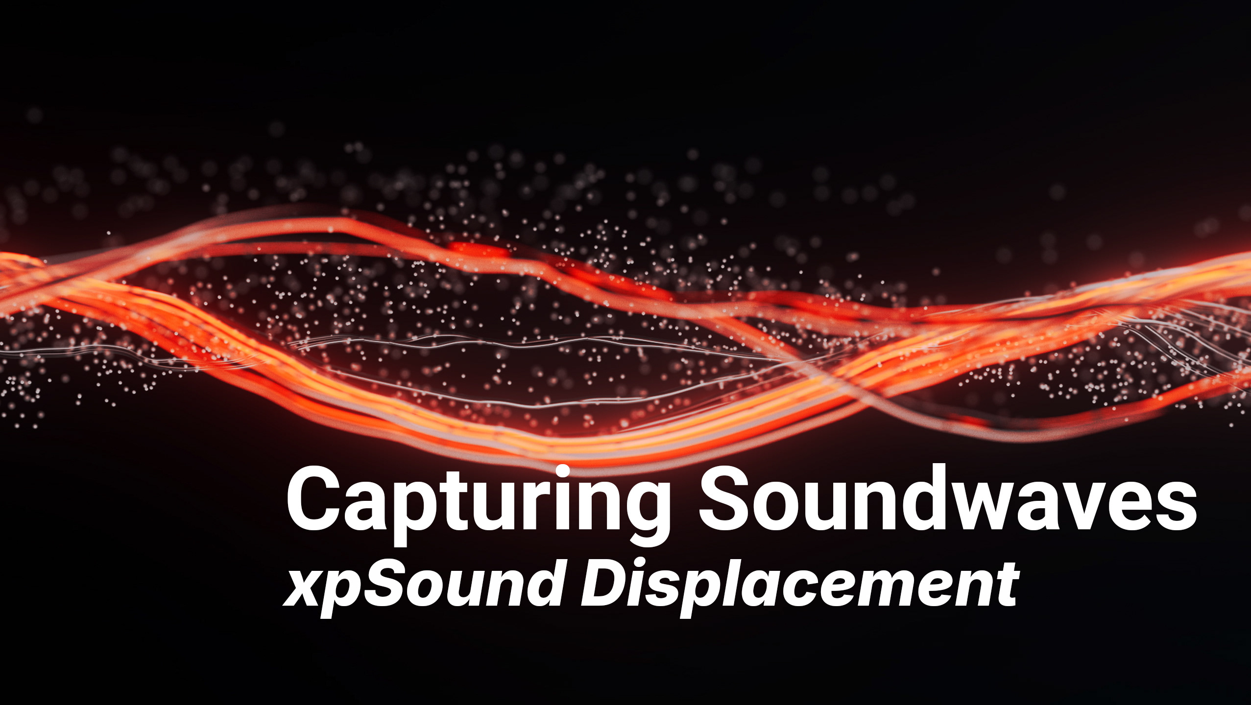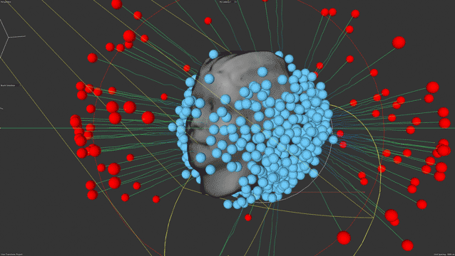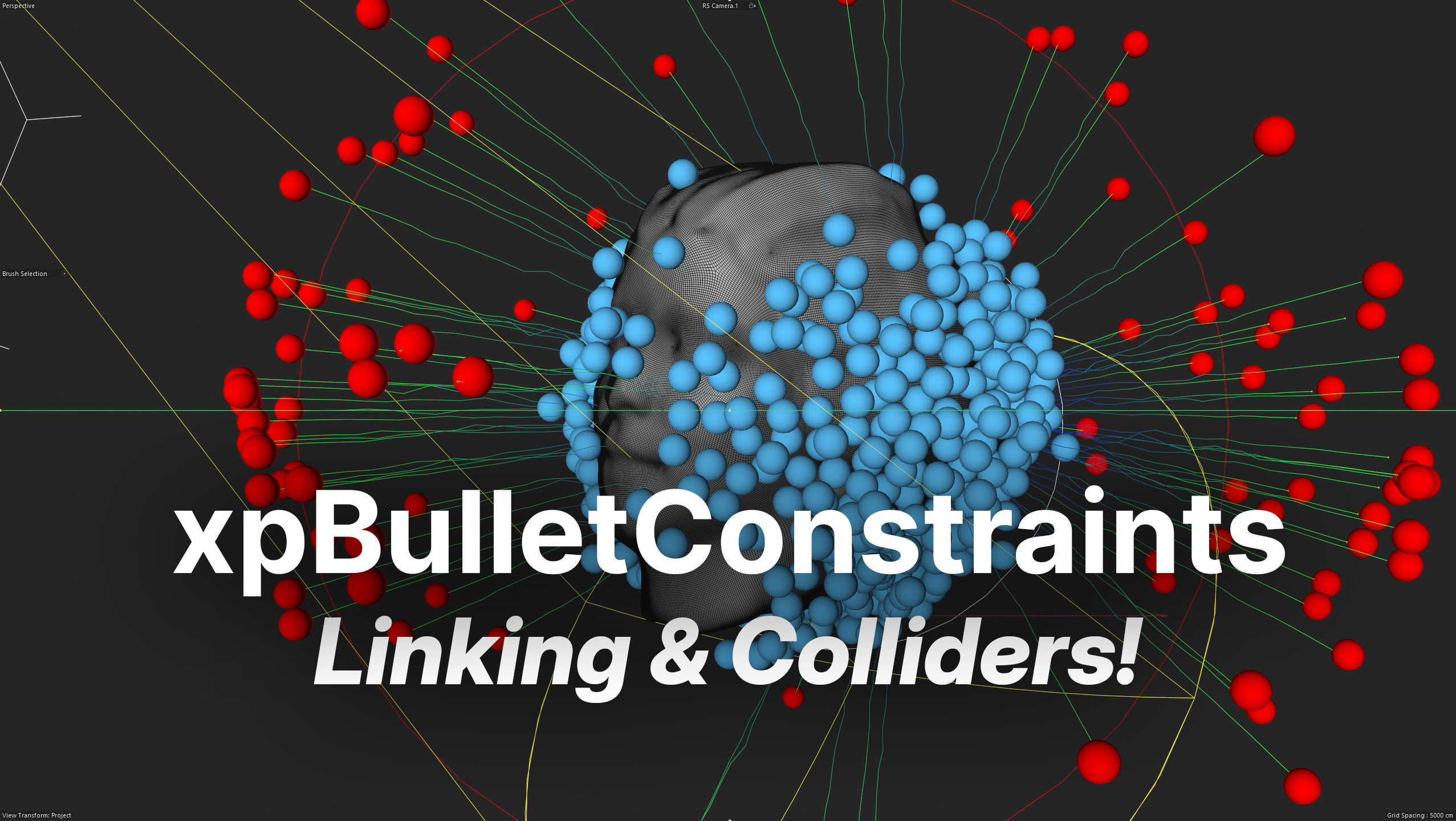
As you aim to take your data visualization skills to the next level, you may feel that something more is needed to bring your visualizations to life and truly make them stand out. That's exactly what this episode of the Dataviz Tutorial series aims to provide. By incorporating X-particles Dynamics and Redshift into your workflow, you'll learn how to create stunning visualizations that are sure to impress your audience. So, let's dive in and bring your data to life!
🔗 Link to Part 1